
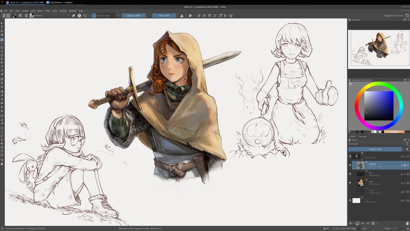
Most artists treat Krita as a “free alternative” to Photoshop or Clip Studio Paint, but after spending years pushing its engine to the limit, I’ve realized that’s a mistake. Krita isn’t just a substitute for character design, it’s a powerhouse if you know where the “hidden” levers are. The difference between a generic character design and an iconic hero often comes down to the technical efficiency of your workflow how quickly you can iterate on anatomy and how precisely you can execute costume details.
Table of Contents
1. Leverage Hybrid Brush Engines for Organic Texture
One trap I see beginners fall into is sticking to the default brushes. For high-end Krita character design, the secret lies in mixing the “Pixel” engine with the “Smudge” engine. When I’m rendering skin or fabric, I don’t just paint colors; I use a smudge brush with a textured tip to “push” the paint into the canvas.
Try creating a custom brush that combines a soft airbrush with a grain texture. This prevents the “plastic look” common in digital art and gives your characters a tactile, painterly quality that feels more professional and less like a generic filter.
2. Strategic Symmetry (and When to Break It)
The Mirror Tool is a godsend for the initial block-in phase. When I’m establishing the primary silhouette of a hero, I use the mirror tool to ensure the proportions are balanced. However, perfectly symmetrical characters look robotic and lifeless.
My workflow is to build the base in symmetry, then immediately disable the mirror tool for the “characterization” phase. I’ll shift the weight of the hips, slightly tilt the head, or add a scar to one eye. This transition from mathematical symmetry to organic asymmetry is what breathes life into a concept.
3. Non-Destructive Iteration via Filter Layers
Nothing kills creativity like the fear of ruining a piece of art. In my testing, the most efficient way to handle costume color swaps is through Filter Layers. Instead of painting the clothes directly, I use a Color Adjustment Filter layer clipped to the clothing group.
If a client or a project lead decides the “royal blue” cape should actually be “crimson,” I don’t have to repaint. I simply double-click the filter layer and slide the hue. This non-destructive approach allows you to experiment with bold color schemes without committing to a permanent change.
4. Using Wrap-Around Mode for Seamless Patterns
Designing intricate costume patterns like Scottish tartans, sci-fi hex-grids, or ornate embroidery can be tedious. Krita has a “secret weapon” here: the Wrap-Around Mode (hit ‘W’ on your keyboard).
When I need a seamless texture for a character’s cloak or armor, I switch to this mode. Anything I paint on the edge of the canvas automatically wraps to the other side. Once the pattern is seamless, I save it as a separate asset and overlay it onto the character using a clipping mask, ensuring the pattern remains consistent across the entire garment.
5. Blending Vector and Raster Layers
Many artists avoid vector layers in Krita, but for character design, they are essential for “clean-up.” I use vector layers to define the primary silhouette and hard-edge armor pieces. Because vectors can be manipulated via nodes, I can tweak the curve of a shoulder pad or the point of a blade without redrawing the line.
Once the structural “skeleton” of the design is locked in with vectors, I switch to raster layers for the organic rendering and shading. This hybrid approach gives you the precision of a CAD tool with the soul of a painting.
6. Advanced .gpl Palette Organization
Consistency is the hallmark of professional character design. If your hero’s skin tone shifts by two shades between the front and back view, the design feels amateur. I manage this by creating a dedicated .gpl palette for every major character.
I don’t just save the main colors; I save the specific shadow and highlight tones. By locking these into a palette docker, I ensure that every piece of concept art for that character maintains a strict visual identity, regardless of the lighting environment.
7. Anatomy Correction with Transform Masks
Even seasoned artists struggle with “wonky” anatomy. Instead of erasing and redrawing a limb for the tenth time, I use Transform Masks. These are non-destructive masks that allow you to warp, scale, or rotate a specific area of your painting.
If I notice a character’s arm is slightly too short or the perspective of the torso is off, I apply a Transform Mask. I can then nudge the pixels into the correct anatomical position. If I overdo it, I can simply delete the mask or adjust the settings without losing the original paint strokes.
8. Optimizing the Reference Images Tool
Cluttering your canvas with floating image windows is a recipe for distraction. I utilize Krita’s dedicated Reference Images Tool (the pin icon). This allows me to pin mood boards, anatomy references, and costume inspirations directly to the workspace.
The pro tip here is to use the opacity slider on your references. When I’m trying to match a specific fabric fold from a real-life photo, I lower the opacity of the reference and overlay it roughly over my sketch to check if the flow of the drapery matches reality.
9. Depth Creation with Advanced Blending Modes
Flat coloring is the enemy of iconic design. To create depth, I move beyond “Multiply” for shadows. For high-energy characters (like those with magic or neon elements), I use Color Dodge and Addition modes for the highlights.
Understanding color theory is vital here. I’ve found that using a deep purple for shadows (instead of black) and a warm orange for highlights creates a cinematic contrast that makes the character pop off the screen. I always apply these on separate layers set to “Overlay” to ensure the base colors remain vibrant.
10. High-Resolution Export for Production
A common mistake in Krita character design is working at a resolution that’s too low. For a character to be production-ready (whether for a comic or a 3D modeler), I always start at 300 DPI with a canvas size of at least 4000px on the longest side.
When exporting, I provide three versions: a full-color render, a flat-color “map” (essential for animators), and a clean line-art version. This professional hand-off ensures that the design is usable across different pipelines without requiring the next artist to “guess” where the lines are.
Mastering the Iterative Process
Character design is rarely a linear path. It is a cycle of sketching, failing, and refining. By utilizing these technical shortcuts in Krita specifically Transform Masks and Filter Layers you remove the friction between your imagination and the canvas.
The goal isn’t to use every tool in the box, but to build a workflow that allows you to fail fast and iterate faster. Start by implementing just two of these tips into your next piece, and you’ll notice a significant jump in both your technical execution and your creative freedom.
Also Check: Krita Landscape Art: 8 Amazing Easy Proven Guide 2026
1 thought on “Krita Character Design: 10 Ultimate Secret Tips 2026”