
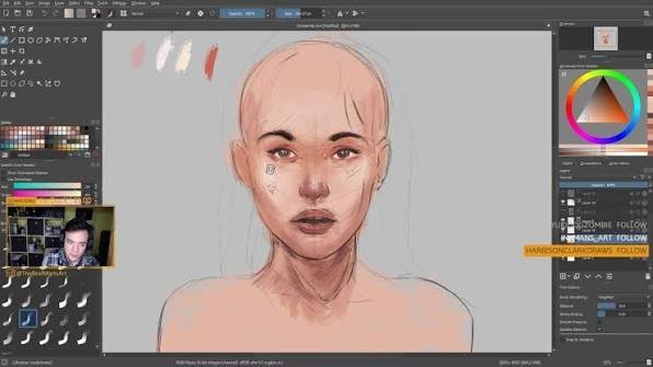
Getting a portrait to look “alive” instead of like a plastic mannequin is the hardest part of digital painting. Over the years, I’ve cycled through various software, but for Krita Portrait Art, the open-source engine offers a specific tactile feel that mimics traditional oils better than almost any other tool. The secret isn’t in the brush you use, but in how you manage the transition between light and shadow across the complex planes of the human face.
Table of Contents
Step 1: The Foundation and Reference Setup
I’ve seen too many artists jump straight into painting without a structural map, only to realize halfway through that the eyes are misaligned. In Krita, the first thing you should do is utilize the Reference Images Tool. Instead of having a separate window open, pin your reference directly to the canvas.
Start with a rough sketch on a dedicated layer. I prefer using a charcoal-style brush with low opacity to block out the basic proportions. Focus on the “T-zone” (eyes, nose, and mouth) first. A common trap is spending too much time on the eyelashes here; ignore the details. You are building a map, not a finished piece. Ensure your canvas is at least 300 DPI to avoid pixelation when you move into the high-detail phase.
Step 2: Blocking in Local Colors
Avoid the temptation to start with a white canvas. I always fill my background layer with a neutral mid-tone usually a muted grey or a deep burnt sienna. This prevents your eyes from being fooled by the bright white background, which often leads to undersaturating your skin tones.
Using a hard-edged brush, block in the “local colors.” This means painting the skin, lips, and eyes in their flat, average colors without any lighting. When doing this for Krita Portrait Art, I recommend using the Color Smudge brush category. These brushes allow you to mix colors directly on the canvas, mirroring the way oil paints blend. Avoid using pure black for the darkest areas; instead, use a deep purple or navy blue to keep the shadows feeling organic.
Step 3: Mapping the Planes of the Face
This is where most beginners struggle. A face isn’t a smooth curve; it’s a series of intersecting planes. To master this, I rely on the concept of the human anatomy and the Asaro Head model. Identify where the light hits the forehead, the bridge of the nose, and the cheekbones.
Create a new layer set to Multiply for your shadows. Instead of blending immediately, paint “hard” shadow shapes. This creates a graphic look that ensures your portrait has depth. If you blend too early, you’ll end up with a “muddy” look a common issue I see in amateur digital portraits. Keep your edges sharp where the bone is close to the skin (like the jawline) and soft where the flesh is thicker (like the cheeks).
Step 4: Refining Skin Tones and Subsurface Scattering
Real skin isn’t one color. It’s a translucent layer over blood vessels and muscle. To achieve realism in 2026, you must incorporate subsurface scattering. This is the effect where light penetrates the skin and glows red/orange in the transition zone between light and shadow (the terminator).
My proven technique for skin:
- The Transition: Add a saturated orange or red line exactly where the light meets the shadow.
- Temperature Shifts: Use cool blues or greens in the shadow areas of the jaw and temples.
- The Blend: Switch to a soft airbrush or a blending brush at 30% opacity to gently marry these colors.
Step 5: Detailing the Features
Now that the volume is established, we move to the “soul” of the portrait. The eyes are the focal point. I always paint the iris with a dark ring around the edge (the limbal ring) to give the eye depth. Add a sharp, high-contrast white specular highlight this is the “spark” that makes the character look alive.
For the nose and mouth, less is more. A common mistake is drawing hard lines for the nostrils or the lip split. Instead, define these areas using value changes. For the lips, use a slightly more saturated red in the center and fade it toward the edges. Remember that the lower lip usually catches more light than the upper lip.
Step 6: Final Polish and Color Grading
The final step is what separates a “painting” from a “piece of art.” I use Krita’s Filter Layers for non-destructive color grading. I typically add a Color Balance layer to harmonize the overall palette, pushing the highlights toward a warm yellow and the shadows toward a cool teal.
To add a final touch of realism, create a new layer on top and add a very subtle “Noise” filter. This breaks up the digital smoothness and gives the piece a slight canvas or film grain texture, which removes that “too-perfect” AI look and adds a professional, hand-painted feel.
Common Pitfalls in Krita Portraiture
Even with a proven workflow, certain edge cases can ruin a piece. Here is a quick breakdown of what to avoid based on my testing:
| Problem | Cause | Solution |
|---|---|---|
| Muddy Skin | Over-blending with a soft brush | Maintain hard edges in 30% of the painting |
| “Flat” Face | Lack of value contrast | Check your values in grayscale; darken the deep shadows |
| Plastic Texture | Too much smooth gradient | Add texture brushes or a noise overlay at the end |
Final Thoughts on Mastering the Craft
Mastering Krita Portrait Art isn’t about finding a “magic brush”; it’s about understanding how light interacts with human anatomy. By following these six steps focusing on structural blocking, plane mapping, and color temperature, you move away from guessing and start painting with intention. The most important thing is to keep your values strong. If the values are correct, you can get away with almost any color choice, and the portrait will still feel three-dimensional and believable.
Also Check: Krita Manga Art: 7 Secret Best Screentone Tips 2026
1 thought on “Krita Portrait Art: 6 Super Fast Proven Steps 2026”